Moody's
Global Header
I led design across Brand Marketing and engineering to give Moody's one global header.
What looked like a UI problem was a brand, platform, and sign-in problem. The proposal I led set the approach and starting point for multi-year work, and the build began.
Most of Moody's portfolio came from acquisition, each product arriving with its own header and engineering stack, which undermined the new brand. Brand Marketing and Engineering agreed on the goal. I led the research, synthesis, and direction to get there.

Comparative Analysis
I started with a comparative analysis: five of Moody's biggest products, audited side by side to find the usage patterns already living across them. It was a working analysis, not a research report, one piece of the ongoing research my team ran within Moody's central design group.

Synthesizing the Patterns
Nearly every product had a search feature, its own logo or branding, and a logged-in profile indicator. Almost nothing about how they were laid out matched: profile alignment shifted with login state, subheaders were used inconsistently, and sub-menus sometimes became sticky on scroll and sometimes did not. That gave me a real map of the inconsistency I was being asked to solve.
The worst inconsistency was color. Every sample used a different shade of blue or white, and even the logo moved between primary, secondary, and tertiary brand colors. That was a symptom of low design maturity: product teams had no single source of truth for applying the brand.
Proposed Design Solution
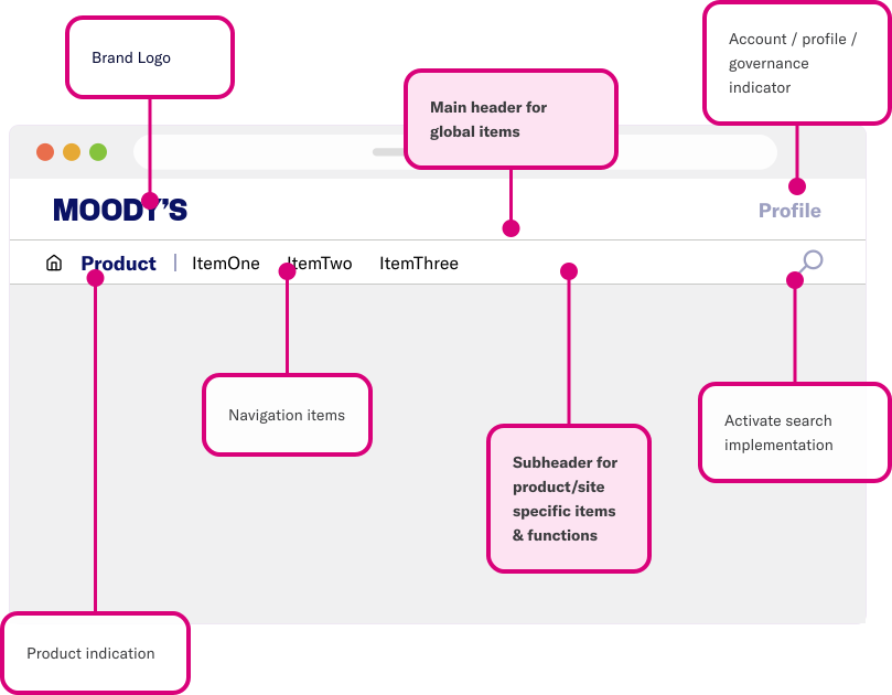
With the research done, I put the whole proposal together as a full mock browser window, main bar and subheader in view, every region called out. Brand logo, product indication, and navigation sit in the main bar; profile and search live on the right; the subheader below carries the product- and site-specific layer.
Simplified Experience
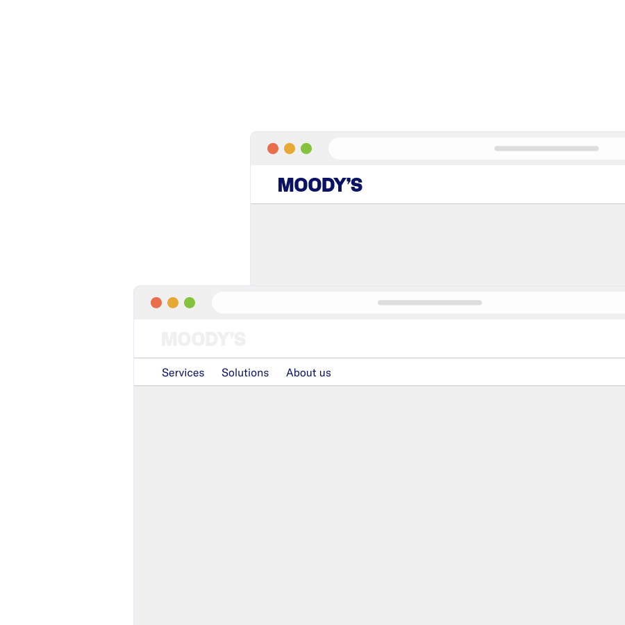
Not every Moody's site needed the full structure. For simpler websites with no specific product or little functionality behind them, I could omit header items rather than force the same complexity everywhere, dropping the subheader or the product indication entirely.
Product-Specific Experience
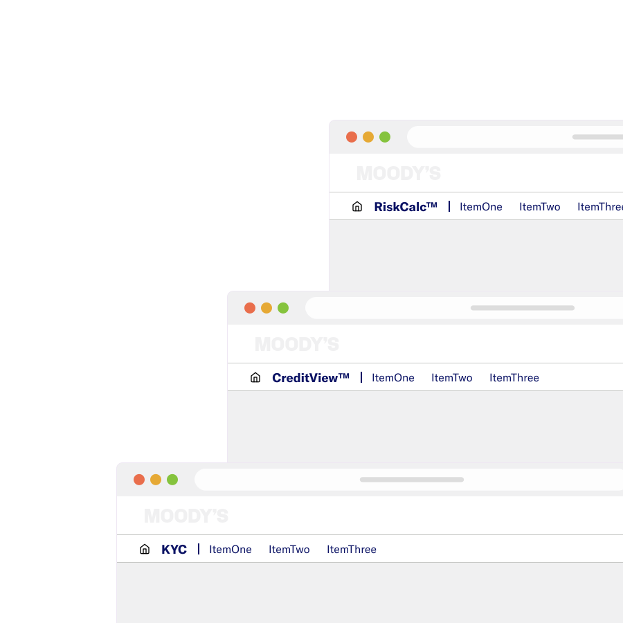
A specific product is named in the subheader, such as RiskCalc™, CreditView™, or KYC, rather than carrying its own logo or branding. The three were chosen on purpose: RiskCalc comes from Moody's 2002 acquisition of KMV, CreditView is Moody's own flagship platform unifying Ratings and Analytics content, and KYC traces to the 2021 acquisition of kompany. Three histories and three engineering roots now sit under one consistent identity, instead of competing with the shared header for attention, or with different tech stacks set up for single sign-on and governance.
Global Navigation Items
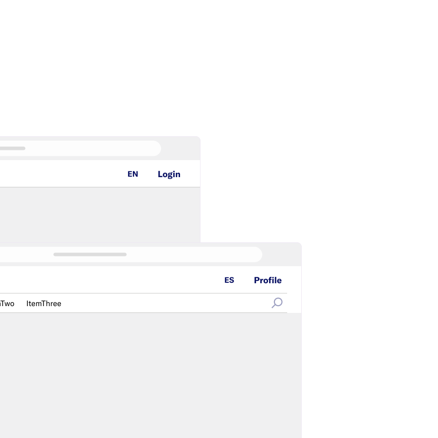
I proposed reserving the main header only for fundamental global items: the login/profile indicator and language localization. Product- and site-specific functions, like search, belong in the subheader. I isolated that right-hand cluster and showed it logged out and logged in to make the boundary concrete.
The profile indicator was also the governance layer. Making it work meant partnering with platform engineering on a shared API and single sign-on (one login across every Moody's product), consolidating the several sign-in systems that acquisitions and isolated teams had built, so any team could adopt the header without rebuilding its own sign-in. Access had to follow each person's role and permissions: internal Moody's staff administering a product, and client administrators managing their own organization's access, each needed more than a standard login.
Additional Sub-Header Functions
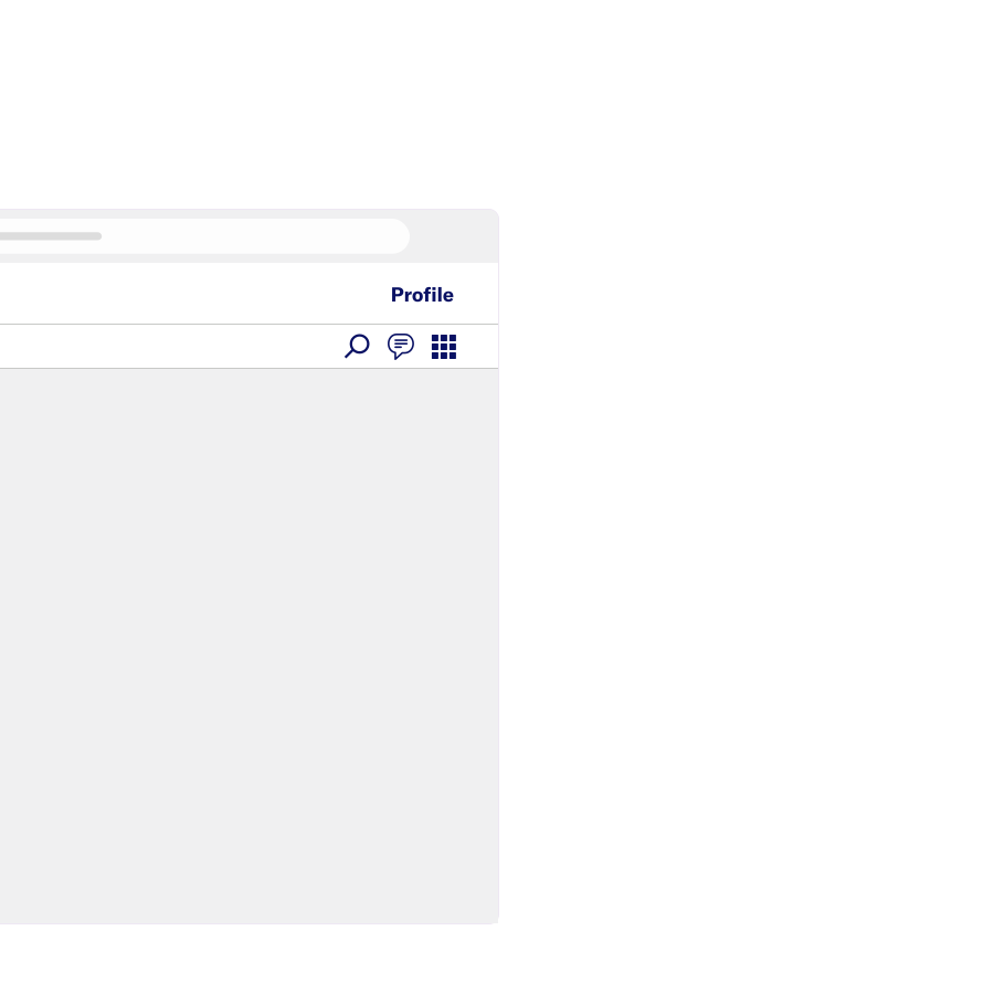
The subheader also had to hold whatever else a product needed, such as chat or a grid or app-switcher icon, right-aligned so it never competed with the primary navigation.
Mobile Web
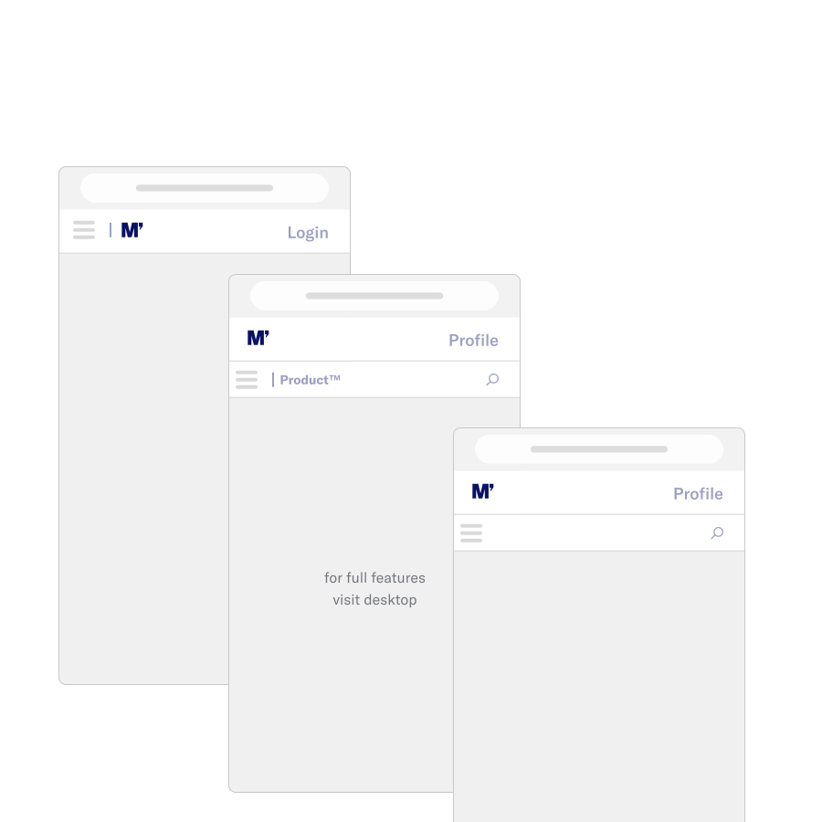
Most Moody's products were not built with mobile in mind; the work suits a desktop far more than a phone. Rather than force a full port, I scoped a lighter mobile treatment: enough of the header's global identity and navigation to orient someone on a small screen, with a clear note that full functionality lived on desktop.
Colorway
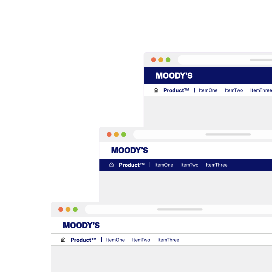
Given how inconsistently color was used, color became one more lever for consistency. The proposal framed the choice: one color combination everywhere, or one colorway for communications sites and another for products. That call belonged to Brand Marketing and the CMO, so the proposal left it with them, and control of how Moody's presents itself moved back to the brand team.
Dark Mode
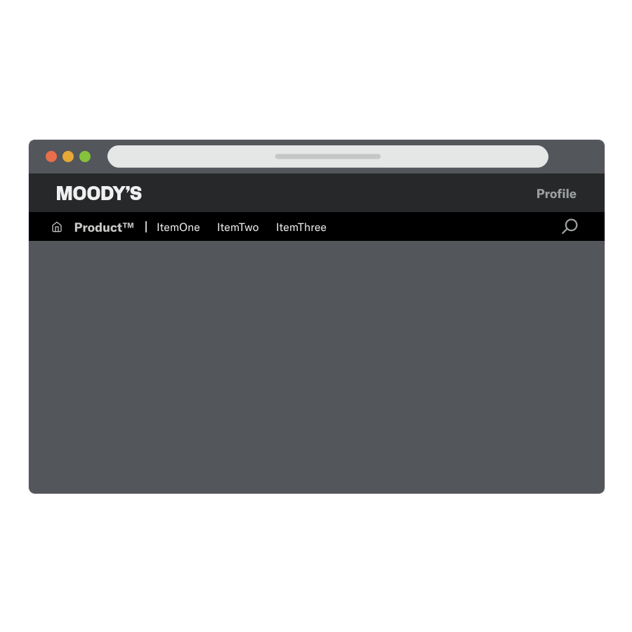
Many teams wanted dark mode. Rather than solve it for the header alone, I extended the dark mode guidance and resources from the central design group to the global header, so it stayed consistent with everything else built on them. Because demand was so broad, dark mode became part of the design system.
Conclusion: The Right Place to Start
No single team owned this problem. Design set the approach: Brand Marketing and the CMO regained control of how Moody's looks, and engineering began the multi-year infrastructure build.