Moody's
Design Ecosystem
As Moody's centralized Design Leader, I built the shared foundation product teams build on.
An internal design site open to every employee, a version-controlled Figma core library, data-viz and Copilot kits, and a 3D-isometric illustration and icon set, all built on the rebrand.
When Moody's set out to define its rebrand with outside agencies, I was one of a select few working with the CMO, representing the products, and I led the infrastructure to embed it across digital platforms as it took shape.
The rebrand launched in early 2024. That work was a key part of the foundation for the company-wide design system, and it let my team reimagine design systems for generative AI.
Modernizing the Brand Identity
The wipe shows the change: Moody's serif wordmark giving way to a new bold one, after more than a year of work with Interbrand. The brand had to honor more than a century of legacy while looking modern, so the new logo draws on Moody's original ratings manuals and the signature blue evolved from the heritage blue. Its principles, bold, clear, and perceptive, with a trajectory of "Decode risk. Unlock opportunity.", set the tone for everything that followed, from color to illustration style. I helped carry them into the core visual language and graphical elements built to scale across Moody's digital products.
Design Maturity Overview
My first year went into deciding what shape a design system should take at Moody's to raise design maturity across the company. The diagram shows the answer. The internal XD website sits at the top and branches into documentation (best practices, brand guidelines, designing for generative AI), design resources (the Figma libraries, from the Core and Data Viz libraries to the Copilot Kit), and developer resources (the global header, CSS, and a JavaScript library). The value is one source of truth that any team building a product can start from.
Internal Website
I created an internal site, open to every employee, as the one place to find the system, and brought my team in to build it with me. Its readers were not only UX designers but also product managers, product strategists, and others building software, so I chose a platform that could hold both polished design guidance and technical documentation.
Figma Libraries
The Core Library is where the system starts. It packages the new logo, typography, and color into a version-controlled Figma library, so every team begins from the same source. It now seeds the foundational UI components and input patterns that inherit those brand tokens.
Design Resource Kits
Two kits extend the core. The Data Viz kit gives teams brand-aligned palettes, chart primitives, mapping guidance, and documentation, so charts stay consistent without guesswork. The Copilot Kit came with the first wave of generative AI work: it captured the behavior models and interaction patterns we were discovering and published them as a central library, so product teams could adopt proven AI patterns quickly and stay within brand and accessibility standards.
Functional and supportive Illustrations and Icons
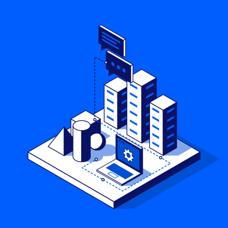
I played a central role in defining the 3D-isometric illustration style and the functional iconography, working with Moody's brand team and DEPT on every visual detail. Drawing on my view across products, I curated the keyword list of features, capabilities, and industry sectors that shaped the initial illustration set. Each icon comes in white and blue colorways, and worked examples on the internal design-system site show how to apply them.
- Less redundant branding and UI
- -40%
Conclusion: One Foundation, Widely Adopted
I worked with about ten orgs and their design and product teams, and at least seven built the design system into their day-to-day work. Redundant colors, logo lockups, and fonts left over from past acquisitions fell 40% as they worked from one foundation. That is higher design maturity in practice.