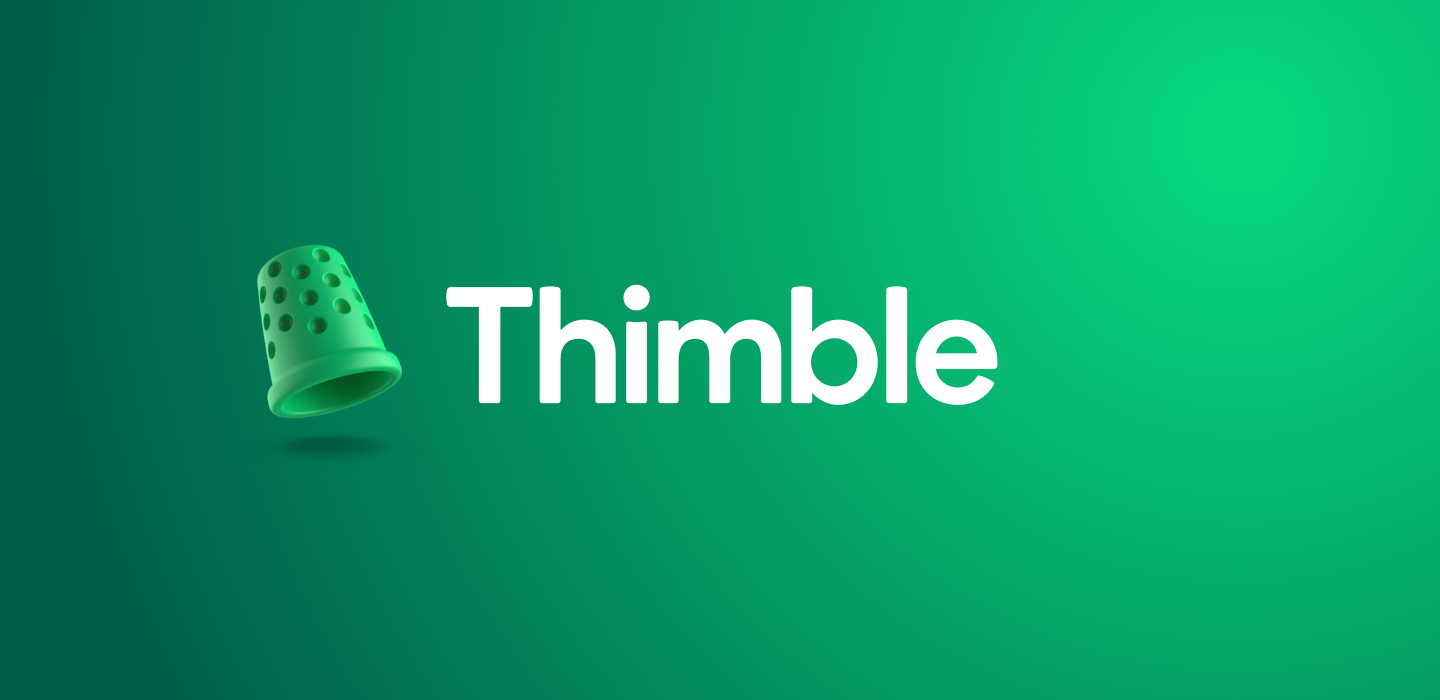
Inside the Thimble Aesthetic
How our Design System breathes new life into the insurance industry.
In developing the new Thimble brand, the design system evolved to reflect our aspirations as a new-school contender in an old-school industry.
What do most designers think about the prospect of designing for insurance?
Boring? Bland? Out of touch? Not interested? Probably all of the above and honestly, you can’t blame them.
Insurance has been one of the last verticals in financial services to be meaningfully reshaped by technology. Its public perception hasn’t helped either, it lacks excitement and feels behind the times. But that’s changing fast. And with that change comes a host of opportunities to solve real problems using modern design practices..
The Starting Point:
Black, Yellow, and Uncanny Valley All Over
Verifly, while an innovative insurance product, was originally built for drone pilots years ago. It has since evolved to offer business insurance to over 160 professions. As one of the new school insurance brands that emerged within the space to disrupt the industry with on-demand insurance offerings, Verifly was very much due for a rebrand.
It was time.
The name and look-and-feel with which Verifly made its entrance needed a refresh. The black and yellow branding, colors often synonymous with DANGER! WARNING! and insects that sting, combined with the mid-century oil painting portraiture aesthetic that dominated the site and app, were not aging well.
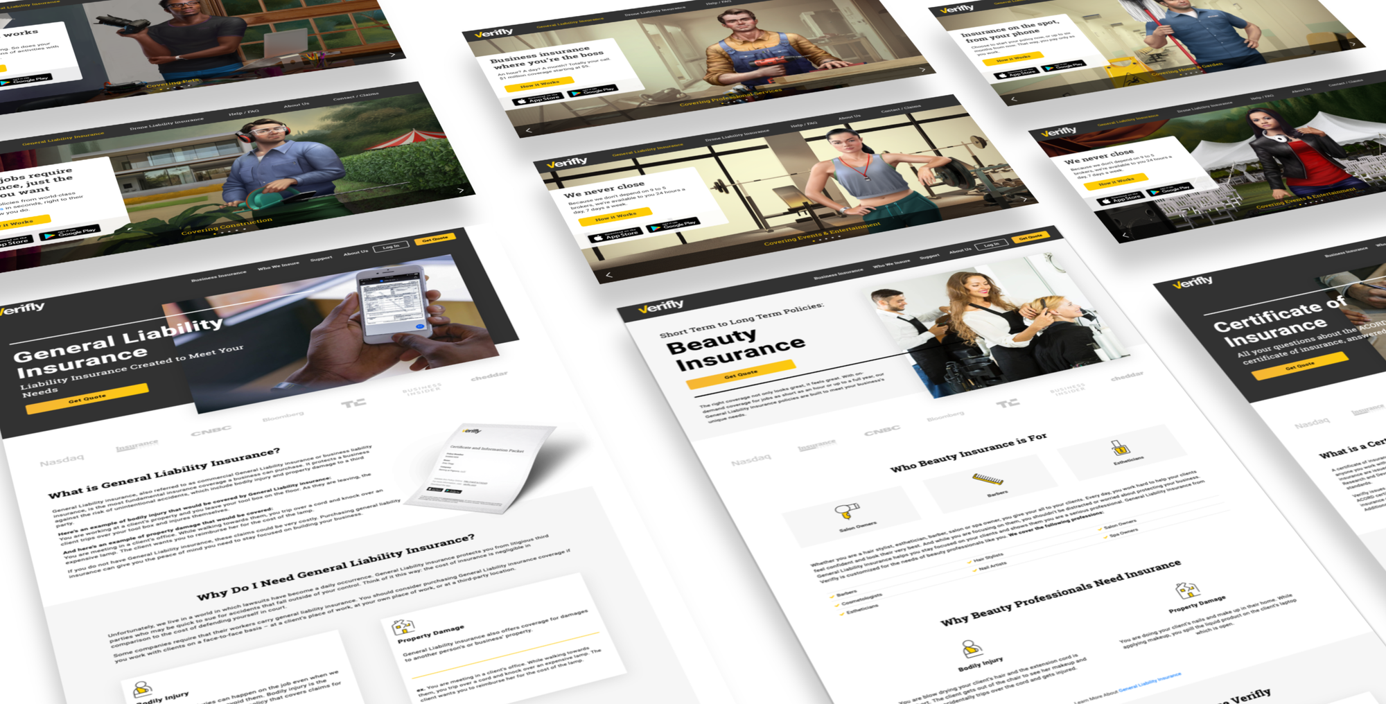
The initial intent of the regal painting illustrations was to make users feel empowered to have more granular control over their business insurance needs. But over time, they started to feel a bit, well... creepy.
The Challenge:
A Visual Aesthetic to Match Our Values and Value Proposition
Our new brand needed a visual aesthetic that resonated better with users. Working with branding agency Red Antler, the challenge was set to develop a new brand identity. The brief was simple (yet difficult): we wanted something new, modern, and tech-forward, yet established and trustworthy enough that you’d feel confident using Thimble for your insurance needs.
Once those challenges were addressed, the resulting brand identity would form the basis for a design system, shaping user interfaces with a new visual language and giving the organization a new zero-point reference to move forward from.
The Resolution:
Standing out from the crowd
Blue is used in many corporate logos for a reason. The psychology of the color blue is said to evoke reassurance and trustworthiness, as well as calm and serenity. The new Thimble brand direction needed to capture some of those values while not getting lost in a sea of similar branding.
After a long assessment with Red Antler on color use across financial and technology verticals, we zeroed in on green as the primary color in our new brand palette. This color seemed notably underused in the financial sector, where many legacy brands default to blue or red.
Developing Our Design System
With an increasingly complex platform spanning web and mobile apps, Thimble had reached a stage where it needed a design system to provide consistency and order. Design systems not only help keep everyone aligned on brand; they also act as living, breathing sets of tools and guidelines that can scale with the company and be embedded into product development cycles and team workflows.
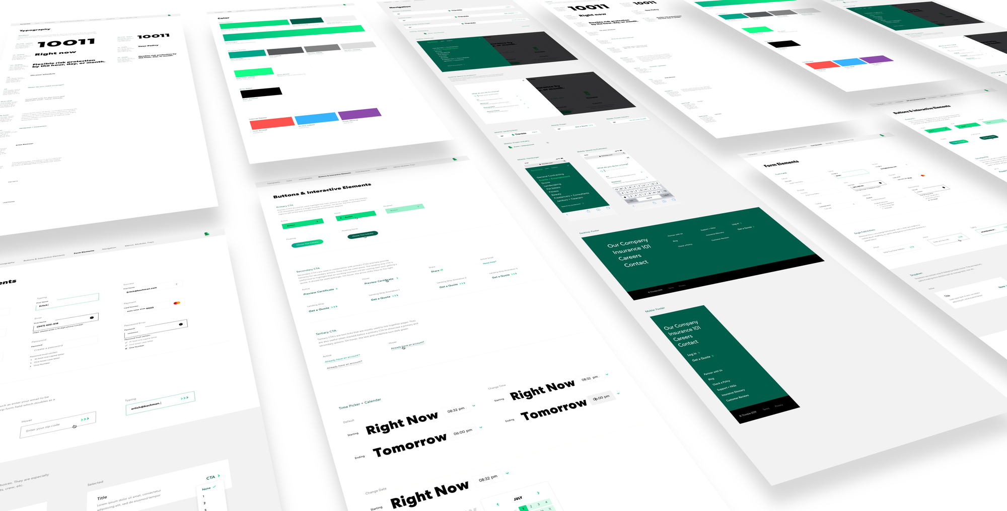
This library merged the new brand direction with reusable UI components and became a single source of truth for the design team.
A full audit of every UI component was conducted to establish the system’s foundation. It eliminated previous inconsistencies and minimized snowflake components. We defined base primitives for grids and layouts, enabling us to integrate new UI elements using the visual language of the brand.
Accessibility was an essential pillar of the design system. Care was taken to ensure all components met accessibility standards. This also marked the beginning of our internal pattern library, a growing repository of proven, reusable components designed for clarity, consistency, and smoother collaboration with engineering throughout the design process.
What’s Next
Insurance can often be more complicated than necessary, weighed down by industry jargon and legalese. The Thimble rebrand gave us an opportunity to redefine the user experience, prioritizing intuitiveness and simplicity as core values of the new visual system.
The results speak for themselves. The difference between the old experience and the new one is night and day. Going forward, our focus is on scaling and refining our design language alongside platform growth, ensuring the system continues to evolve and translates seamlessly into tools like Figma as our needs mature.